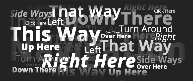
Website typography?
Is the understanding of typography and its usage really important in the design of a website today or is this just a throwback to an old paper based society that people harp on about who don’t want to let go of the past. There are many people who understand the importance of typography, unfortunately these days they are, more often, individuals of a certain age – those who grew up when paper had a different value.
There was a time, before the Internet, when important information was committed to paper as a means of presenting it to someone. The weight of the paper could be used to convey the gravitas of the information and the Fonts together with their layouts were a means of focussing the reader on the important parts of the document.
The problem is that in today’s website based market, some people seem to have forgotten the important lessons learned through years of dealing with paper and some are failing to transfer those principles through to their web pages. Lets look at some of those for a moment.
The envelope had a role to play in getting the information to the reader. People thought carefully about choosing the envelope to make sure that it stood out from everything else in the recipient’s post in an attempt to ensure it arrived in pristine condition and presented the right impression even before it was opened to reveal it’s contents.
There were fundamentally three main factors to consider in the choice of paper, it’s colour, weight and weave. To put this another way, it’s colour was all about the way it looked; its weight was all about the way it supported itself when you held it; it’s weave was all about the way it felt in the reader’s hand. In short, this all related to the way that the information was given into the reader’s hand.
What has this to do with website typography today? Absolutely everything! People have not changed; they still need to understand how important something is. It changes the way in which they read things and their expectation of the information they are about to read. In short, if they know it is important, they are more likely to pay attention.
The envelope
Look at it this way. The envelope correlates exactly with the link to your home page, or the landing page, of your website. This is the first view the reader has and when they open it up it presents them with the information you want them to read. Does it clearly show the reader who it is from? Does it clearly excite the reader for what they have to do next?
Think for a minute about how you act naturally. Your post arrives at home, you pick it up from the doormat and you look through it expecting it to be either bills that you don’t want to receive or rubbish that you wish people would stop sending to you.
Before you open the envelope, you take a quick look to see from whom it has come that quickly determines for you how interested you are in it’s content. You often know if it is a bill by the envelope and you also know that you will not be excited about it. Equally, you often know by the envelope if its from some irritating direct mail company that you wish had never heard of you and you know it is not worth opening.
The only thing that has changed is that your doormat is now your inbox and there is more mail than ever for you to sort through. The email may say, “click on this link” and when you hover over it you get to see something like this one I received this morning (I have changed the name to protect the innocent):
http://email.somecompanyorother.co.uk/_act/link.php?mId=C9276340768830895146421996433621&tId=121744043
Wow! Doesn’t this just fill you with joy? You can bet your bottom dollar (as our friends over the pond say) I am not interested in opening this – why should I be? This is obviously just another piece of garbage from another marketing company.
Would it have been better if the link had been embedded in some nice picture, placed there to excite me? Probably. But more than that, it would have been much better if the link had information that made sense to me; something that gave me hope in opening it.
The paper
In exactly the same way, the paper correlates with the page of your website upon which your reader will land. No, your reader can’t exactly rub his or her fingers over it to be excited by the way it feels. However, this can still be portrayed by the way it looks. This requires a transition in the way we use the different media.
Unfortunately there are many people who have not managed to make this transition successfully. Don’t get me wrong, the use of a clean sheet of white paper can still be employed on a website however, on its own, it can leave the reader feeling a bit uneasy. It is a bit like having post from a company that has not used a letterhead; it can lack the professionalism that you would expect it to have.
The same is true with the choice of paper. Using a background colour or image to represent the weave or weight of the paper can have the wrong affect as it can be overpowering and detract from the words that are written on it. All of these things are a question of personal choice, but remember it is the reader’s impression that counts not yours apart from your market branding.
There are other issues to consider as well such as the size of the paper. Let me explain, direct mail marketers have argued for years over the size of the paper to be used and how many folds it should have. Questions have been asked about a fold being a benefit or a problem for the reader to contend with. Is it a barrier to the reader getting the information or is it revealing to the reader.
Look at the way the newspapers handle this. The main headlines are above the fold and not beneath it. This should be the same on a website. The main headlines that will draw you reader to the information (to give them a reason to read the information) should be above the fold of your website – or put another way, visible without having to scroll down.
The next question then is how do you use the right typographical principles and arrangements in your website. That is something I will cover in my next blog on this subject.


